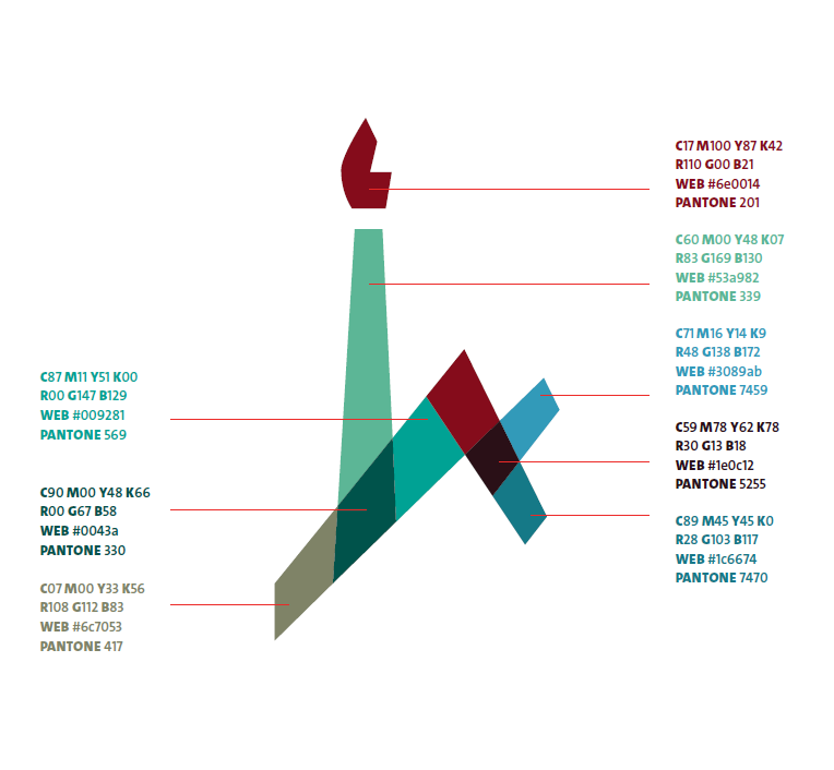
The new Hebrew University logo is based on the original symbol designed in 1954 by the late artist Zelig Segal. Like the original, it comprises a flame representing the torch of learning, and the letters alef and ayin representing the University’s name in Hebrew.
Unique and distinctive in the world of higher education, the logo expresses innovation and modernity, while offering a contemporary homage to the University’s rich heritage.
The logo’s colored mosaic icon is comprised of different components, transparent and overlapping. It represents plurality, variety, transparency and accessibility.
The shape of the icon and its components must not be altered. The color combination is absolute and the colors must not be changed or rearranged.
The new visual language was designed with a view toward the University’s diversity, its many constituent parts, and its continuing adaptation and expansion.
The goal was to create a unique, unified and consistent look that is solid, memorable and easy to identify from both outside and within the organization.

