Graphics: Typography, Shapes and Colors
The University’s new visual language was designed to meet the varied needs of the University and its many units.
The new language is based on three main elements: typography, shapes and colors.
Typography:
As part of the new branding, a new font has been in Hebrew, called “HUJI,” which is used exclusively by the Hebrew University. HUJI is used in headlines only. Other text in Hebrew is written in New Font (ניופונט). For English we use TheSans font.
HUJI

The Sans
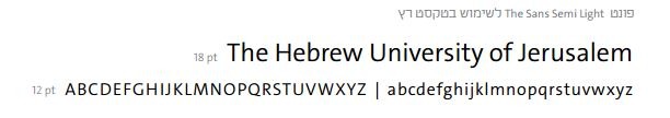
New Font

Shapes:
The Shapes of the new design language are comprised of two polygons, one on top of the other. The base shape is a fixed-positioned square with a cut angle in the top corner. A transparent polygon is positioned on top of it, and it can be of different shapes and colors.

Colors:
The color is a dominant and important component in the University's new design language. The chosen color scheme is unique in the academic landscape, conveying freshness and innovation. The use of distinctive colors adds depth and richness to the brand.
See examples on the next page
Colors
The logo of the University is dynamic and diverse. To reflect it graphically, there are five different color series for different uses.
There are also designated color variations for colors on which it is possible to add text in white or in black, as shown in the examples provided here and in the Brand Book.
Series 1 - Color + Beige
(see CMYK, RGB, WEB & Pantone here)

Series 2 - Color and Gray
(see CMYK, RGB, WEB & Pantone here)

Series 3 - Bright colors
(see CMYK, RGB, WEB & Pantone here)

Series 4 - Neutral colors
(see CMYK, RGB, WEB & Pantone here)

Series 5 - Monotonically colors
(see CMYK, RGB, WEB & Pantone here)
